When you’re ready to do a remodeling project, there are a lot of decisions to be made. You’ll certainly have preferences for the layout and use of the newly remodeled space, and you can do research to compare appliances and fixtures, but what do you do when it comes to choosing colors?
There are several ways to approach the process. If the new space flows into another room, you’ll want to choose colors that blend with existing décor. But what if it doesn’t need to match another room? Where do you begin? Trendy or classic? Bold or safe? Light and airy or dark and dramatic?

How Should the Space Feel?
The feeling you want your remodeled space to convey is one of the most important things that should guide your color choices. If you desire spa serenity in your master bathroom, select soft, warm earth-tone colors for your tile, flooring and walls. Burnished fixtures in gold, bronze and copper finishes coordinate with this décor, though they are more trendy choices that may look out-of-date more quickly than brushed nickel.
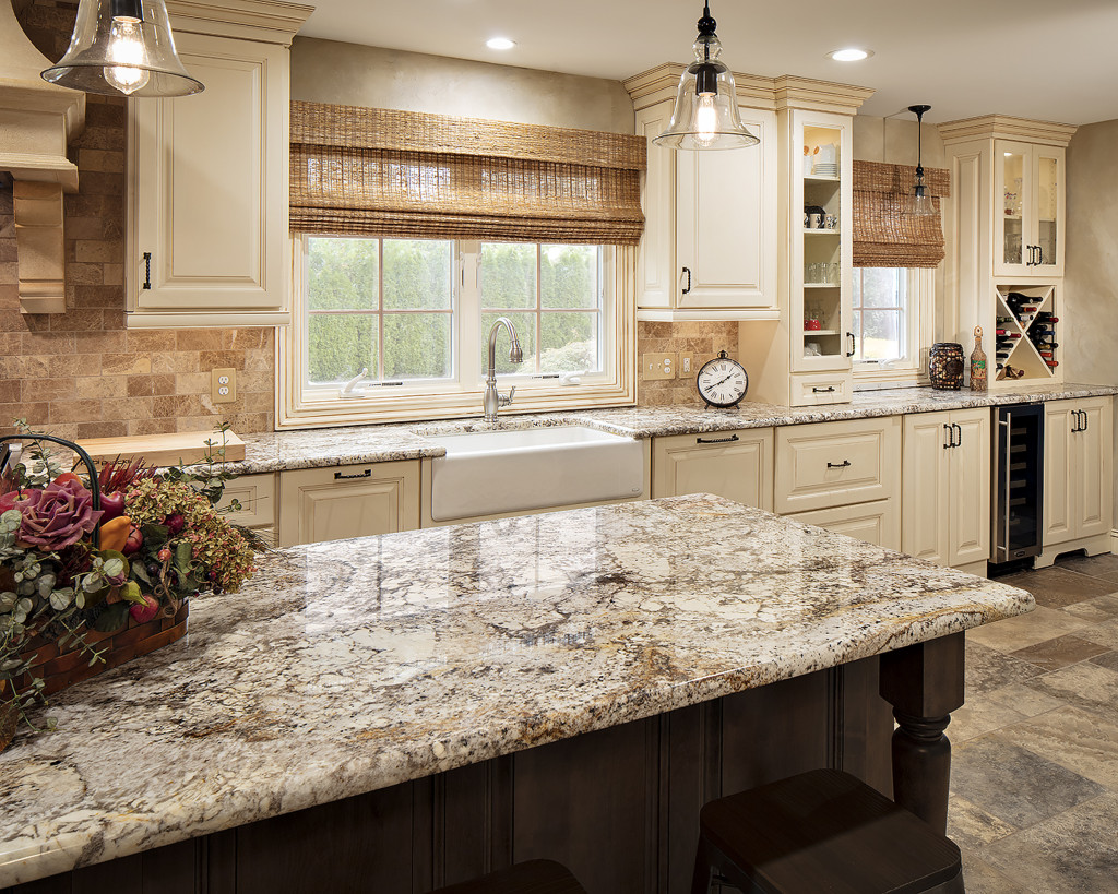
White kitchens are still very popular, and if you’re looking for “light and bright” it’s a great way to go. Add in some pops of colors that you love, to keep things interesting. If you prefer a “comfort” kitchen, soft colors and natural woods help you achieve it. Cabinets are also now available in a wide variety of finishes and stain colors, which can be appealing, but daunting. But you can go with just an island or a grouping of cabinets in a color with the rest in a neutral or stained wood.
Are “Color of the Year” Trends Helpful?


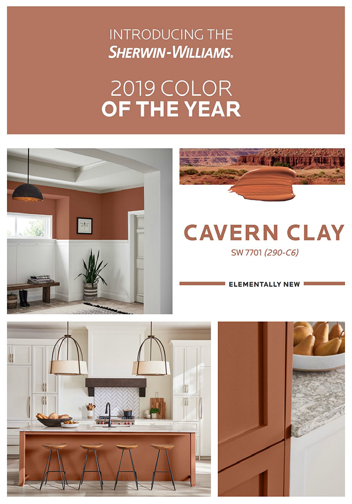
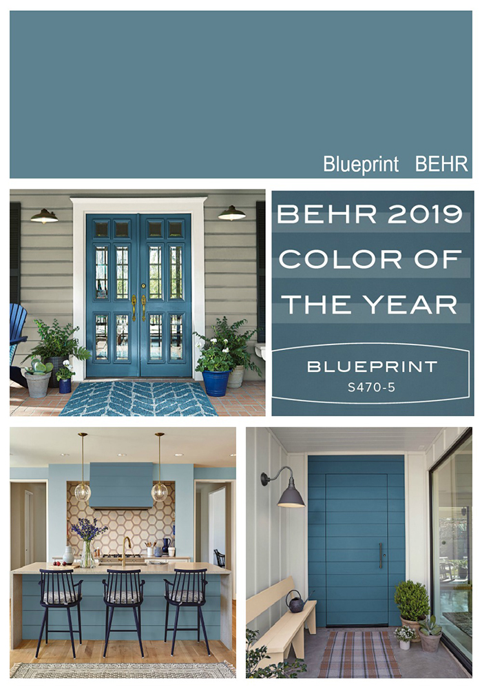
This is the time of year when you’ll start seeing predictions for the “Color of the Year” for 2019. If you need help picking a color, it is one place to start looking for inspiration. Many of the major paint companies are making selections for the “Color of the Year” that they think will be showing up in home décor. Most of the predictions for 2019 are colors of nature, healing, and rejuvenation. Several companies have chosen soothing blue-green hues: Behr picks “Blueprint”; PPG Paint shows “Night Watch”; Dutch Boy selected “Garden Patch”. Sherwin Williams’ favorite color evokes the Desert Southwest: “Cavern Clay”. Benjamin Moore continues previous trends by highlighting “Metropolitan,” a warm gray.
Paint companies like Behr and Benjamin Moore have lots of easy ways to look at colors: by trends, by color families, by mood. Some even have tools that let you digitally try out colors on walls of different rooms, or even on an uploaded image of your own home.
What if You Change Your Mind?
Are you daring or cautious? If you’re not confident in picking a trendy color, stick with neutrals for the basics and use more daring colors for accents. Be bolder with things you can more easily change: a statement wall, upholstered furnishings, tile, or even wall art. Wallpaper is back in style again and can be a terrific stepping-off point for helping you choose a set of coordinating hues.

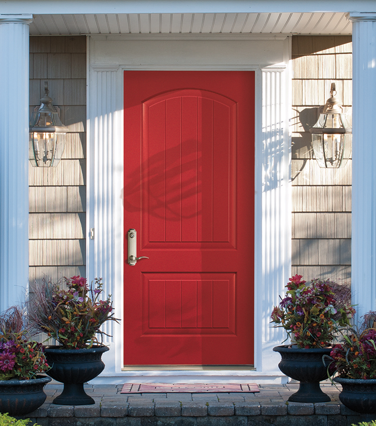
Your front door color is a feature that is easy to change with a coat of paint. It should be welcoming and friendly. A bright or dark color points the way for guests. And a fresh-looking front door is on the top of the list of things that bump up the curb appeal of your home.
Whether you look for inspiration online or start with fabric or a piece of artwork, the important thing is that you choose colors that you love looking at every day. When we design your new space, we’re very happy to listen to your thoughts and guide you in your choices. We can make suggestions that we think will be perfect for you and your family. Let’s talk!
